Technical screeners have a tendency to become trading machines.
Add enough indicators, assign thresholds to them, combine them into a score, and eventually the dashboard starts producing BUY, HOLD and SELL signals.
That isn’t what I want from an AI infrastructure screener.
The purpose of this screener is much narrower:
Find stocks whose technical condition is interesting enough that I should open the chart and investigate further.
The distinction matters.
An RSI above 70 does not necessarily mean “sell.” A stock trading 10% above its 50-day moving average does not necessarily mean “overbought.” And a stock with an RSI below 30 is certainly not automatically a buy.
Markets—particularly strongly trending technology markets—are more complicated than that.
The screener’s job is therefore not to make the decision. It is to direct attention.
The Indicators
For my AI infrastructure watchlist, I’m currently using seven technical measures in addition to price and daily price change.
PDMA20 — Price Distance from the 20-Day Moving Average
PDMA20 measures how far price is above or below its 20-day moving average:
PDMA20 = (Price − MA20) / MA20 × 100
A value of +5 means price is 5% above its MA20. A value of -5 means it is 5% below it.
PDMA50 and PDMA200 apply exactly the same idea to the 50-day and 200-day moving averages.
Together, the three numbers provide a compact picture of where price sits relative to short-, intermediate- and long-term trends.
DIV2050 — MA20/MA50 Divergence
DIV2050 measures the separation between the 20- and 50-day moving averages:
DIV2050 = (MA20 − MA50) / MA50 × 100
This is particularly useful around crossovers. A value close to zero tells us the MA20 and MA50 are converging.
BBW — Bollinger Band Width
BBW measures the width of the Bollinger Bands relative to the 20-day moving average:
BBW = (Upper Band − Lower Band) / MA20 × 100
Low values indicate volatility compression. Rising values indicate volatility expansion.
RSI14 is the familiar 14-period Relative Strength Index.
VRatio compares the most recent completed trading day’s volume with the average volume of the preceding 20 trading days.
A VRatio of 1.5 means volume was approximately 50% above its recent average.
“Overbought” Is Not Necessarily Bearish
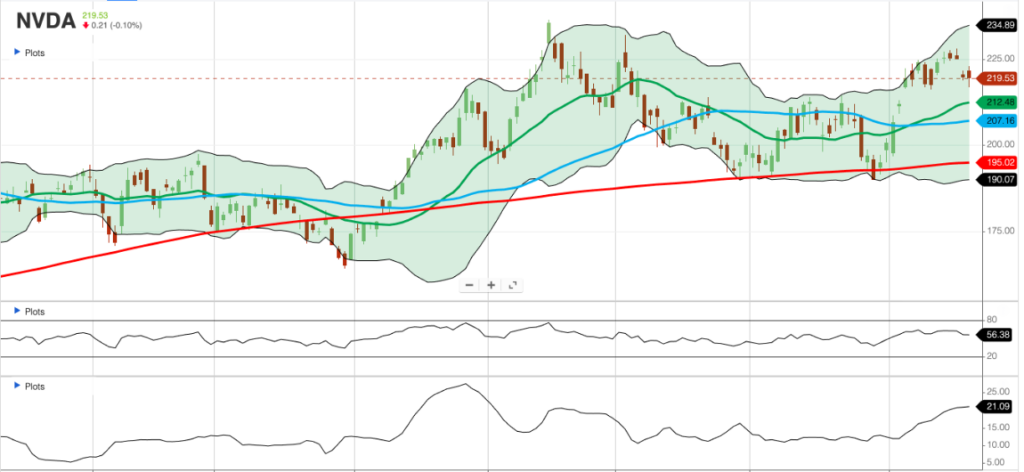
Consider NVIDIA from today’s screener:
| Indicator | NVDA |
|---|---|
| Price | $219.40 |
| PDMA20 | +3.44% |
| PDMA50 | +6.02% |
| PDMA200 | +5.21% |
| DIV2050 | +2.50% |
| BBW | 21.45 |
| RSI14 | 77.41 |
| VRatio | 0.86 |
A textbook interpretation of RSI might immediately label NVIDIA “overbought.”
But look at the rest of the evidence.
NVDA is only 3.44% above its MA20 and 6.02% above its MA50. Its MA20 is 2.50% above its MA50, and recent volume is actually below its 20-day average.
That is quite different from a stock trading 20% above its MA20 on twice normal volume with RSI at 85.
So I would highlight 77.41 on the screener—not because it is a sell signal, but because it is an interesting condition.
The chart gets the final vote.
Strong Momentum Can Persist
EME provides an even more interesting example:
| Indicator | EME |
|---|---|
| PDMA20 | +2.56% |
| PDMA50 | +2.03% |
| PDMA200 | +1.06% |
| DIV2050 | -0.52% |
| BBW | 24.13 |
| RSI14 | 76.69 |
| VRatio | 0.68 |
Again, RSI is high.
But EME isn’t dramatically extended from any of its major moving averages. Price is only about 2% above MA20 and MA50.
Even more interesting, DIV2050 is -0.52%.
That means MA20 is still slightly below MA50 and the two averages are close together.
That combination—high RSI, price above the major averages, and MA20 very close to MA50—is far more interesting than simply saying “RSI > 70.”
It merits opening the chart.
Oversold Doesn’t Mean Buy
At the other extreme is ACM:
| Indicator | ACM |
|---|---|
| Price | $63.47 |
| Daily change | +2.97% |
| PDMA20 | -9.14% |
| PDMA50 | -8.58% |
| PDMA200 | -9.07% |
| DIV2050 | +0.62% |
| BBW | 29.66 |
| RSI14 | 27.93 |
| VRatio | 0.92 |
Traditional technical analysis says an RSI below 30 is “oversold.”
But look at ACM’s trend structure.
Price is approximately 9% below all three moving averages.
That’s not merely a strong stock experiencing a minor pullback. The price structure has weakened substantially.
The +2.97% daily move and RSI of 27.93 certainly make ACM interesting. But the screener should not translate that into “BUY.”
Instead:
Something unusual is happening. Open the chart.
Is the stock beginning a reversal? Is this simply a bounce inside a declining trend? Has it found support? Is there evidence of accumulation?
Those are chart questions.
A Pullback Inside a Strong Trend Is Different
ANET presents almost the opposite structure:
| Indicator | ANET |
|---|---|
| Daily change | -2.34% |
| PDMA20 | +1.00% |
| PDMA50 | +7.29% |
| PDMA200 | +8.91% |
| DIV2050 | +6.23% |
| RSI14 | 68.91 |
| VRatio | 1.15 |
Despite today’s decline, ANET remains above all three moving averages.
Price is only 1% above MA20 but remains 7.29% above MA50 and 8.91% above MA200.
That can describe a very different condition:
A short-term pullback within a still-strong intermediate trend.
RSI at 68.91 also remains strong without quite crossing the conventional 70 threshold.
Again, I don’t want the screener deciding what to do with ANET.
I want it helping me recognize the structure.
MRVL Shows Why One Indicator Is Never Enough
MRVL may be today’s most striking example:
| Indicator | MRVL |
|---|---|
| Daily change | +9.86% |
| PDMA20 | +15.22% |
| PDMA50 | +0.24% |
| PDMA200 | +0.20% |
| DIV2050 | -13.01% |
| BBW | 35.27 |
| RSI14 | 70.87 |
| VRatio | 1.19 |
A nearly 10% daily move immediately deserves attention.
Price is now 15.22% above MA20, RSI has moved above 70, and Bollinger Band Width is very high.
Yet price is only fractionally above MA50 and MA200.
And DIV2050 is an extraordinary -13.01%, meaning the MA20 remains far below the MA50.
This is precisely the kind of situation where reducing the data to a single bullish/bearish score would throw away information.
Something significant is happening.
The chart should tell us what.
Volume Is Confirmation, Not Direction
Volume provides another useful example of why the indicators should be interpreted together.
Today’s VRatios range mostly around 0.7–1.2:
- AVGO: 1.24
- MRVL: 1.19
- ANET: 1.15
- TSM: 1.11
- GEV: 1.10
- NVDA: 0.86
- EME: 0.68
Nothing here represents extraordinary participation.
That itself is information.
For example, MRVL’s 9.86% price move becomes even more interesting because yesterday’s completed volume was only 1.19 times its previous 20-day average. If subsequent sessions show VRatio moving toward 1.5 or 2.0 while the move continues, that would add another piece of evidence.
But volume doesn’t tell us direction.
A VRatio of 2.0 accompanying a breakout and a VRatio of 2.0 accompanying a collapse are very different events.
Once again, the screener identifies the anomaly. The chart supplies the context.
Bollinger Band Width Needs Historical Context
BBW may ultimately become one of the most valuable indicators in the screener.
Today’s values illustrate why absolute thresholds are dangerous:
| Stock | BBW |
|---|---|
| CMI | 9.27 |
| TSM | 13.61 |
| CAT | 13.64 |
| GEV | 15.71 |
| NVDA | 21.45 |
| EME | 24.13 |
| MU | 29.13 |
| ANET | 29.71 |
| VRT | 32.18 |
| MRVL | 35.27 |
It would be tempting to declare:
BBW below 10 = Bollinger squeeze.
But that ignores the normal volatility characteristics of each stock.
A BBW of 12 might be extraordinarily compressed for MRVL while being perfectly ordinary for CMI.
The better measure will eventually be something like BBW percentile:
Current BBW is in the 8th percentile of this stock’s BBW observations over the previous six months.
Now we know that volatility is unusually compressed for that particular stock.
That is much more useful than an arbitrary universal threshold.
What Should the Screener Highlight?
This leads to the design principle I’m adopting.
Most cells should remain visually quiet.
A cell gets highlighted only when something merits investigation.
Examples might include:
Momentum extremes
- RSI > 70
- RSI < 30
Price extension
- unusually high positive PDMA20
- unusually high positive PDMA50
Pullbacks within an intact trend
- PDMA20 near or below zero while PDMA200 remains strongly positive
- RSI falling toward 40 while the longer-term trend remains intact
Moving-average transitions
- DIV2050 approaching zero from below
- DIV2050 crossing zero
- PDMA200 approaching zero
Volatility events
- BBW unusually low relative to its own history
- BBW beginning to expand rapidly following compression
Participation
- VRatio above approximately 1.5
- especially high volume combined with volatility expansion
The screener doesn’t have to explain all of this.
It may simply turn an interesting number blue.
That is enough to say:
Look here.
From Screening to Investigation
This creates a deliberate separation between screening and decision-making.
The screener answers:
Which stocks deserve my attention?
The chart answers:
What is actually happening?
Suppose a row eventually shows:
BBW unusually low + DIV2050 near zero + PDMA20 positive.
That is interesting because volatility is compressed, MA20 and MA50 are converging, and price has already moved above the short-term average.
It is not a buy signal.
It is an invitation to open the chart and look for the actual pattern: Is price breaking resistance? Are the Bollinger Bands beginning to expand? Is MA20 turning upward through MA50? Is volume confirming the move?
Likewise:
RSI 78 + PDMA20 +12% + PDMA50 +18% + expanding BBW
doesn’t automatically mean sell.
It means:
This stock is unusually extended. Investigate.
That distinction is particularly important in strong technology trends, where conventional “overbought” conditions can persist much longer than expected.
The Goal: An Attention-Routing System
That is ultimately how I think about this AI infrastructure screener.
It isn’t an automated trading system.
It is an attention-routing system.
With 15 or 20 stocks on a watchlist, I don’t want to study 20 detailed charts every day. I want the data to identify the two, three or four stocks whose current technical state is unusual enough to justify closer inspection.
Most of the dashboard should therefore be boring.
When something stops being boring, that’s when I want the screener to tell me.
And then I open the chart.